 by Danny Donovan
With smartphones leading the way in how people access the internet, designing for mobile has become the foundation of modern web development.More than half of all web traffic now comes from mobile devices. Search engines like Google prioritize mobile-friendly websites in their rankings, and users expect fast, clean, and easy-to-navigate experiences on smaller screens. For businesses looking to compete online, designing for mobile is no longer optional, it is the starting point. At Dsquared Media, we have seen firsthand how designing for mobile affects user engagement, bounce rates, and conversion success. Making mobile the top priority ensures that your site connects with today’s audience right where they are.
Smartphones are everywhere. From checking emails to making purchases, users often rely on their phones more than their desktop computers. Most people have their phones within reach all day, which makes it the default platform for browsing, searching, and shopping. As behavior has shifted, expectations have also changed. If a website loads slowly, has hard-to-read text, or requires zooming and scrolling, visitors will likely leave within seconds.
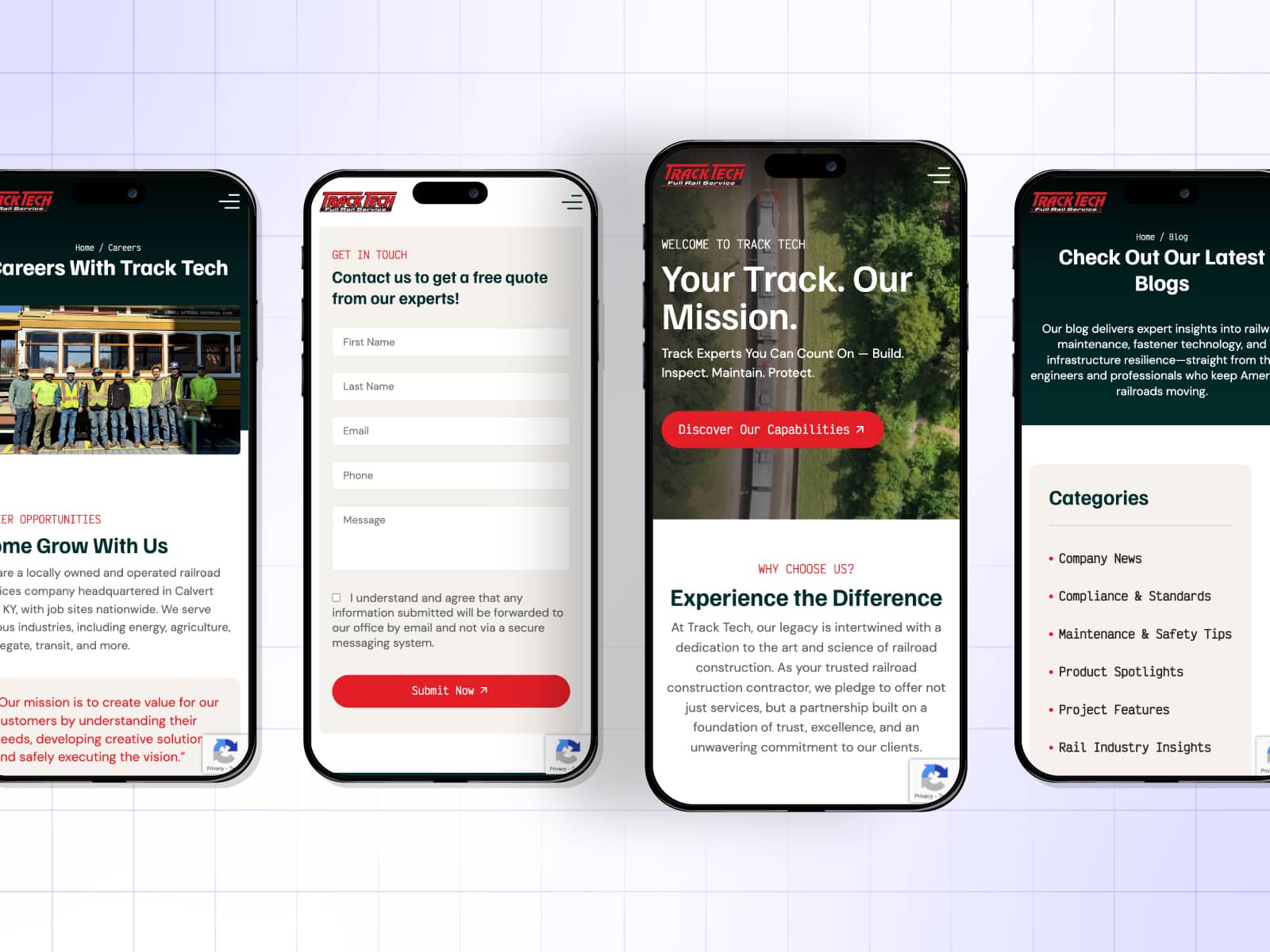
Designing for mobile helps avoid these issues. It focuses on creating layouts and functionality that work well on smaller screens, including faster load times, responsive menus, and content that is easy to tap and swipe. Instead of shrinking a desktop site down to fit a phone, a mobile-first design builds from the smallest screen up. That approach creates a cleaner, faster, and more focused experience.
Google uses mobile-first indexing, meaning the mobile version of a website is what gets evaluated for rankings. If your site performs poorly on mobile, it will likely struggle to show up in search results, even if your desktop version is well designed. Mobile-friendly websites benefit from better rankings, more traffic, and a stronger online presence overall.
By designing for mobile, you improve more than just appearance. You also increase visibility and create a smoother experience for visitors, which helps with longer visits and more conversions.
Designing for mobile requires a different mindset than traditional desktop design. While desktop allows for more space, hover effects, and multi-column layouts, mobile design works within tighter boundaries. It must prioritize clarity, speed, and usability with one-handed navigation and thumb-friendly buttons.
Content also needs to be concise and readable. Long paragraphs, tiny text, and oversized images can become barriers on mobile screens. A mobile-first approach means streamlining the content, using strong visual hierarchy, and making sure everything adapts to the device. Once the mobile layout is set, designers can expand it for tablets and desktops without losing function or style.
There are many reasons to put mobile first when designing or redesigning a website:
Dsquared Media focuses on building digital experiences that adapt and perform across all devices, starting with mobile as the foundation.
Many businesses that prioritize designing for mobile see a clear boost in performance. We’ve worked with brands that reduced bounce rates by over 30 percent just by streamlining mobile layouts. Others saw contact form submissions and e-commerce sales increase after optimizing navigation and load speed for smartphones.
When a site looks great and works smoothly on mobile, visitors are more likely to stay, explore, and take action. That often translates directly into more leads and revenue.
If you’re planning to update or build a new site, keep these mobile-first elements in mind:
Working with a design team that understands mobile-first strategy makes a big difference. Dsquared Media crafts websites that are functional and stylish, no matter what device users prefer.
Desktops are still important, especially for certain industries and B2B environments. But as user behavior continues to shift toward mobile, the desktop version must serve as an extension of the mobile design, not the other way around. When sites are built desktop-first, mobile layouts often feel clunky or incomplete. By putting mobile first, you ensure the foundation is strong and scalable.
Designing for mobile is not just about adjusting for screen size. It’s about meeting people where they are and giving them a seamless digital experience on the devices they use most. At Dsquared Media, we build mobile-first websites that load quickly, look sharp, and convert visitors into customers. If your website feels outdated or difficult to use on a phone, it may be time to rethink your approach. Let mobile lead the way.

Make your business vision a reality by giving your brand the competitive edge it needs with our branding and strategy consulting services. Our blend of creative skill and marketing experience is specifically tailored to help businesses define, refine, and elevate their brand identity. Through in-depth market analysis, consumer research, and creative brainstorming sessions, our team of expert consultants collaborate closely with clients to develop brand narratives and strategic positioning that resonate with their target audiences.